

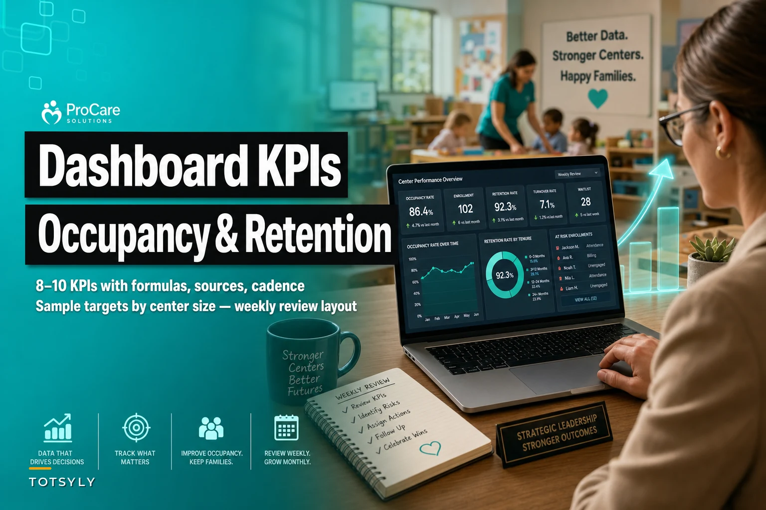

Most childcare dashboards track vanity metrics. Enrollment numbers, total revenue, basic attendance percentages. Meanwhile, the real operational indicators that predict whether families stay or leave get buried in spreadsheets nobody checks.
Centers tracking the right 8-10 KPIs catch problems weeks before they impact enrollment. Centers watching generic metrics discover issues only after families have already left.
The difference between proactive and reactive operations comes down to which numbers you measure, how often you check them, and what targets you set based on center size — not what looks good on a board presentation.
Why Standard Childcare Metrics Miss Critical Warning Signs
Traditional daycare dashboards focus on outcomes, not indicators. You see enrollment dropped last month. Great. But the warning signs showed up six weeks earlier in utilization patterns, staff overtime trends, and parent communication delays.
A 45-child center in Michigan tracked enrollment religiously. Perfect 92% capacity for months. Then suddenly lost 8 families in two weeks. Looking back, the indicators were obvious: teacher overtime had crept up around 23% over two months, parent response times stretched from same-day to 48 hours, and afternoon classroom ratios consistently ran at maximum allowed levels.
The enrollment number told them nothing until families were already gone. The operational KPIs would have flagged the brewing crisis weeks earlier.
Centers under 30 kids also need different warning thresholds than 100+ child facilities. A teacher calling out sick hits differently when you have 4 staff versus 14. Parent communication delays matter more when you serve 25 families who all know each other versus 80 families spread across multiple programs.
The 10 KPIs That Actually Predict Center Health
1. Utilization Rate vs Enrollment Rate
Simplify your childcare center’s daily operations.
Totsyly helps you manage enrollments, staff, and communications efficiently so you can focus on care.
- Streamlined enrollment & waitlist management
- Automated billing & payment tracking
- Staff scheduling & attendance monitoring
No credit card required
Formula: (Actual Daily Attendance / Enrolled Capacity) × 100
Data Source: Daily sign-in records compared to enrollment roster
Reporting Cadence: Daily tracking, weekly analysis
Targets by Center Size:
-
Under 30 children
85-90%
-
30-60 children
82-88%
-
60+ children
80-85%
Smaller centers need higher utilization because fixed costs spread across fewer families. A 25-child center running at 75% utilization is likely operating at a loss. A 75-child center at that same rate can still maintain positive margins.
Track this daily but analyze weekly patterns. Monday and Friday dips are normal. Tuesday through Thursday dipping below 80% signals scheduling misalignment or family dissatisfaction.
2. Staff Overtime Ratio
Formula: (Overtime Hours / Total Hours Worked) × 100
Data Source: Payroll system, timesheet records
Reporting Cadence: Weekly
Targets by Center Size:
-
Under 30 children
<5%
-
30-60 children
<8%
-
60+ children
<10%
Overtime creeping above these thresholds predicts burnout and turnover. A center with 6 teachers averaging 12% overtime will likely lose at least one of them within a few months. The replacement cost and training disruption ripples across every family in that classroom.
3. Parent Response Time
Formula: Average hours between parent communication and center response
Data Source: Email timestamps, message app data, communication logs
Reporting Cadence: Weekly
Targets by Center Size:
-
Under 30 children
<4 hours
-
30-60 children
<6 hours
-
60+ children
<8 hours
Parents expect faster responses from smaller centers where they have a more personal relationship with staff. A 20-child center taking 24 hours to respond to a basic schedule question loses trust faster than a 100-child center with the same delay.
4. Classroom Ratio Compliance Buffer
Formula: (Maximum Allowed Ratio - Actual Average Ratio) / Maximum Allowed Ratio × 100
Data Source: Daily classroom counts, licensing requirements
Reporting Cadence: Daily tracking, weekly review
Targets by Center Size:
-
Under 30 children
20% buffer minimum
-
30-60 children
15% buffer minimum
-
60+ children
12% buffer minimum
Running at maximum ratios leaves zero room for a staff absence or an unexpected enrollment shift. Centers consistently operating below a 10% buffer see significantly more compliance close calls and parent complaints about supervision.
5. Collection Rate Velocity
Formula: (Payments Received by Day 5 / Total Monthly Tuition) × 100
Data Source: Billing system, payment records
Reporting Cadence: Monthly on day 5
Targets by Center Size:
-
Under 30 children
92%+
-
30-60 children
88%+
-
60+ children
85%+
Small centers can't float late payments. Five families paying two weeks late in a 20-child center can disrupt payroll. The same situation in an 80-child center creates friction, but it's more manageable.
6. Waitlist Conversion Rate
Formula: (Families Enrolled from Waitlist / Total Waitlist Contacts) × 100
Data Source: Waitlist tracking, enrollment records
Reporting Cadence: Monthly
Targets by Center Size:
-
Under 30 children
40%+
-
30-60 children
35%+
-
60+ children
30%+
Low conversion usually points to poor waitlist management or a declining market position. Centers should be contacting waitlist families at least monthly — not just when spots open.
7. Teacher Retention Indicator
Formula: (Teachers Employed >6 months / Total Teaching Positions) × 100
Data Source: HR records
Reporting Cadence: Monthly
Targets by Center Size:
-
Under 30 children
85%+
-
30-60 children
80%+
-
60+ children
75%+
New teacher turnover disrupts classroom dynamics more in smaller centers where children have fewer teachers overall. A toddler room losing their primary teacher affects 8 families directly. The same loss in a large center disrupts routine, but the relationship damage isn't as deep.
8. Incident Report Frequency
Formula: Number of incident reports per 100 child-days
Data Source: Incident documentation system
Reporting Cadence: Weekly
Targets by Center Size:
-
Under 30 children
<2 per 100 child-days
-
30-60 children
<2.5 per 100 child-days
-
60+ children
<3 per 100 child-days
Rising incident rates predict supervision gaps before anything serious happens. Track minor incidents too, not just reportable injuries. A sudden shift in the pattern matters more than the absolute number.
9. Family Engagement Score
Formula: (Families attending events or participating in communications / Total Enrolled Families) × 100
Data Source: Event attendance, newsletter opens, app engagement
Reporting Cadence: Monthly
Targets by Center Size:
-
Under 30 children
70%+
-
30-60 children
60%+
-
60+ children
50%+
Engagement drops tend to precede withdrawal. Families who stop reading newsletters, skip events, and minimize drop-off conversations usually leave within 60 days or so. Smaller centers should maintain higher engagement because personal connection is a big part of what they offer.
10. Schedule Efficiency Rate
Formula: (Scheduled Staff Hours Used / Scheduled Staff Hours) × 100
Data Source: Scheduling system vs actual timesheets
Reporting Cadence: Weekly
Targets by Center Size:
-
All sizes
92%+
When scheduled hours consistently go unused, you're burning budget. When you're constantly calling in extra help, you're understaffing. Either pattern creates operational stress that eventually shows up in other metrics.
Building Your Weekly Operational Review Dashboard
The physical layout matters almost as much as the metrics themselves. Centers that display KPIs on a single screen during weekly reviews make better decisions than those clicking through multiple reports.
Top Row - Immediate Indicators:
-
Utilization Rate (with 7-day trend line)
-
Staff Overtime Ratio (current week vs 4-week average)
-
Classroom Ratio Buffer (lowest room highlighted)
-
Incident Frequency (with type breakdown)
Middle Row - Trend Metrics:
-
Parent Response Time (weekly average with outliers flagged)
-
Collection Rate Velocity (current vs 3-month average)
-
Family Engagement Score (with participation breakdown)
-
Teacher Retention Indicator (with upcoming milestone dates)
Bottom Row - Planning Metrics:
-
Waitlist Conversion Rate (with contact recency)
-
Schedule Efficiency Rate (by classroom)
Color code thresholds based on your center size targets. Red for critical, yellow for warning, green for healthy. Nobody should need to do math during the meeting to know whether a metric needs attention.
> Weekly KPI Review Process: Raw data sources (attendance logs, payroll, billing, communication tools) → automated or manual aggregation → KPI calculations applied → thresholds checked against center-size targets → flagged metrics surface for review → director identifies patterns across combined metrics → intervention decisions made and assigned
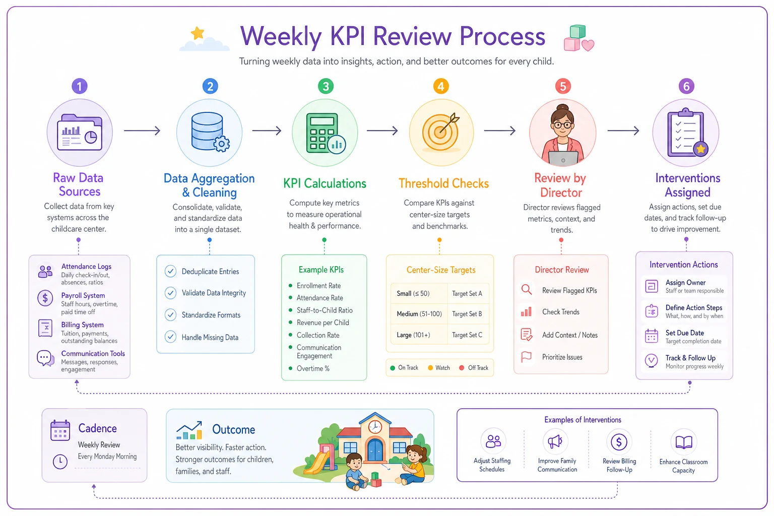
Here's a simple visual of that weekly KPI review flow.
That sequence sounds simple, but the places where it breaks down — usually at the aggregation or calculation step — are exactly where most centers lose visibility.
Common Mistakes That Sabotage KPI Tracking
Measuring everything equally. A center tracking 47 different metrics ends up paying attention to none of them. Pick your core 10, review them consistently, and only add specialized metrics when you're solving a specific problem.
Setting identical targets across all classrooms. Infant room utilization naturally runs lower than preschool due to scheduling complexity. Adjust targets by age group, not just center size.
Reviewing monthly instead of weekly. Monthly reviews catch problems after they've already developed. A utilization drop over one week might be weather or a stomach bug going around. Three weeks of the same pattern signals something deeper.
Automate aggregation and limit your core KPIs to 10 so weekly reviews stay focused and actionable.
Focusing on absolute numbers instead of trends. An 87% utilization rate sounds fine. But if you were at 93% last month, something is clearly wrong. The direction and velocity of change matter more than where you sit today.
How Operational Software Changes the KPI Picture
Manual KPI tracking falls apart because it requires someone to pull data from multiple systems, run the calculations, and build visual reports every single week. By week three the process gets skipped. By month two you're back to reactive management.
Modern operational platforms built with AI automation can aggregate data from attendance systems, billing software, communication tools, and scheduling platforms automatically. The calculations happen in the background. Your Monday morning review starts with every KPI already calculated, visualized, and flagged.
The more useful part is pattern detection. A gradual 0.5% weekly decline in afternoon utilization might look like normal variation on its own. But combined with a 3% increase in parent response time and two consecutive weeks of teacher overtime, that pattern starts to tell a story about staffing stress that will impact families within a month.
The software doesn't replace judgment. It just makes sure you're working from complete, current information rather than incomplete reports from two weeks ago.
Real-World Impact: From Reactive to Predictive Operations
A 52-child center in Ohio implemented this KPI framework after losing 6 families in one month without any advance warning. Their previous "dashboard" was essentially monthly enrollment counts and basic revenue totals.
The weekly KPI reviews immediately revealed what had been invisible:
| Metric | Before | After 4 Weeks |
|---|---|---|
| Afternoon Utilization | 71% (down from 84%) | Recovering to 79% |
| Lead Teacher Overtime | 14% average | Reduced through schedule adjustments |
| Parent Response Time | ~19 hours average | Back under 6 hours |
| Ratio Compliance Buffer | <5% in 3 classrooms | Restored with float teacher hire |
Within four weeks of making targeted changes based on those insights, afternoon staffing schedules were adjusted, a communication routing system brought response times back under 6 hours, and one additional float teacher was hired to restore ratio buffers.
Six months later, enrollment had grown to 58 children — not from marketing, but from operational improvements that families noticed and told other parents about.
Your Next Monday Morning Meeting
Stop reviewing last month's enrollment numbers and revenue totals. Those are outcomes, not indicators. Start tracking the 10 KPIs that actually predict whether families will stay or leave.
Your weekly operational review should answer three questions:
-
Which metrics moved outside acceptable ranges this week?
-
What pattern do the combined metrics reveal?
-
What specific intervention do we implement this week?
The centers that grow don't always have better locations or bigger budgets. They have better visibility into what's actually happening operationally, and they act on warning signs before problems compound.
Setting up a real operational dashboard takes effort upfront — connecting data sources, calculating baselines, establishing center-specific targets. But once it's running, the weekly review becomes your early warning system for every operational challenge that threatens retention. Every family that leaves quietly represents missed signals in your operational data, and the question is whether you'll start tracking them before or after your next enrollment drop.
Ready to elevate your childcare management?
Join hundreds of childcare providers using Totsyly to save time, improve communication, and grow their centers.